NAACP Spokane Website

NAACP Spokane wanted a website that would demonstrate their current momentum, with new leadership, fresh ambitions, and recent growth of 35% in just 35 days. The new website needed to showcase the broad scope of their work and influence, show a stronger connection to the national organization, and create more opportunities for users to be inspired — and act on it.

This work was completed as an employee of Treatment. I was responsible for creative direction, content strategy, UI/UX design.


Intro.png

The site is calibrated to facilitate engagement while remaining incredibly adaptable to changing priorities.


An abbreviated menu showcases the most important items in the header: our work, join us, take action, donate.


Progress bars with specific funding goals drive donations.


A module and page for a “We Are the NAACP” campaign gives them the opportunity to showcase the diversity of the organization and communicate that, yes, white people can and should join.


A flexible module allows them to feature and point to content anywhere on the site. For example, an upcoming event or a scholarship with applications currently open.

As users explore the scope of the organization, options for deeper engagement are always at their fingertips.


It’s important for users to be able to browse all news, all action items, and all resources, but they should also be able to find the relevant ones for each committee. I designed a page builder that will allow each committee to customize their own pages by pulling the relevant content from the other areas of the site.


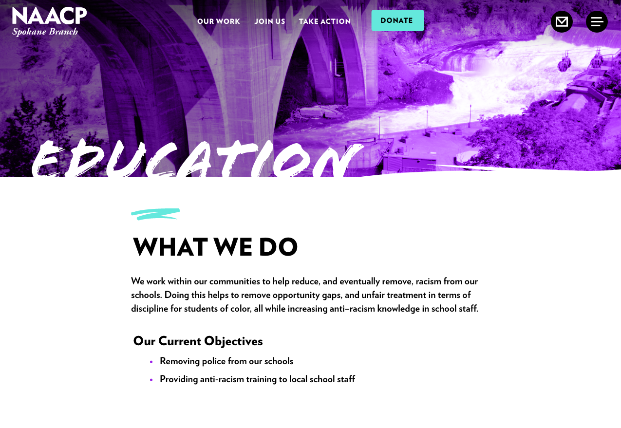
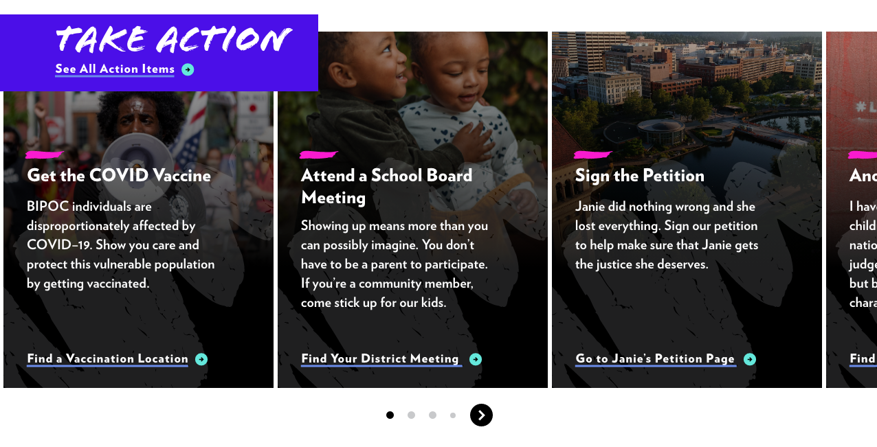
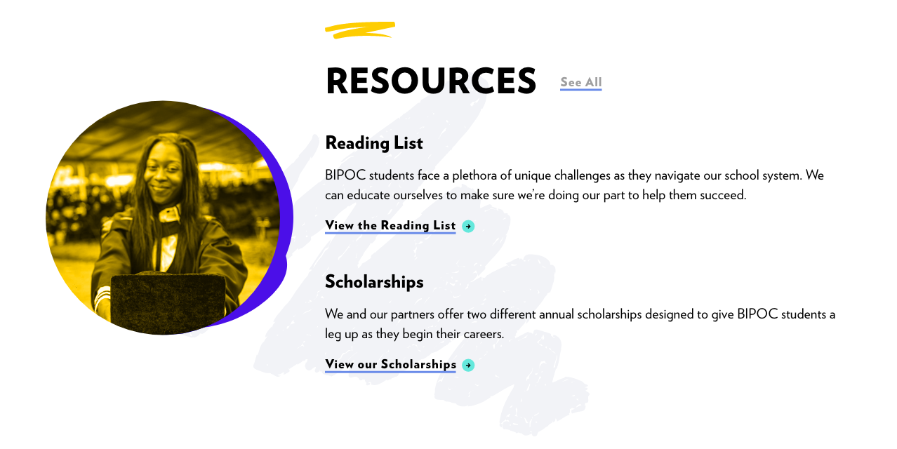
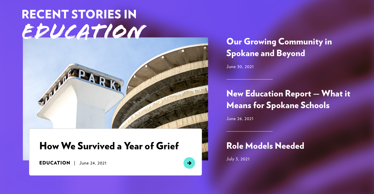
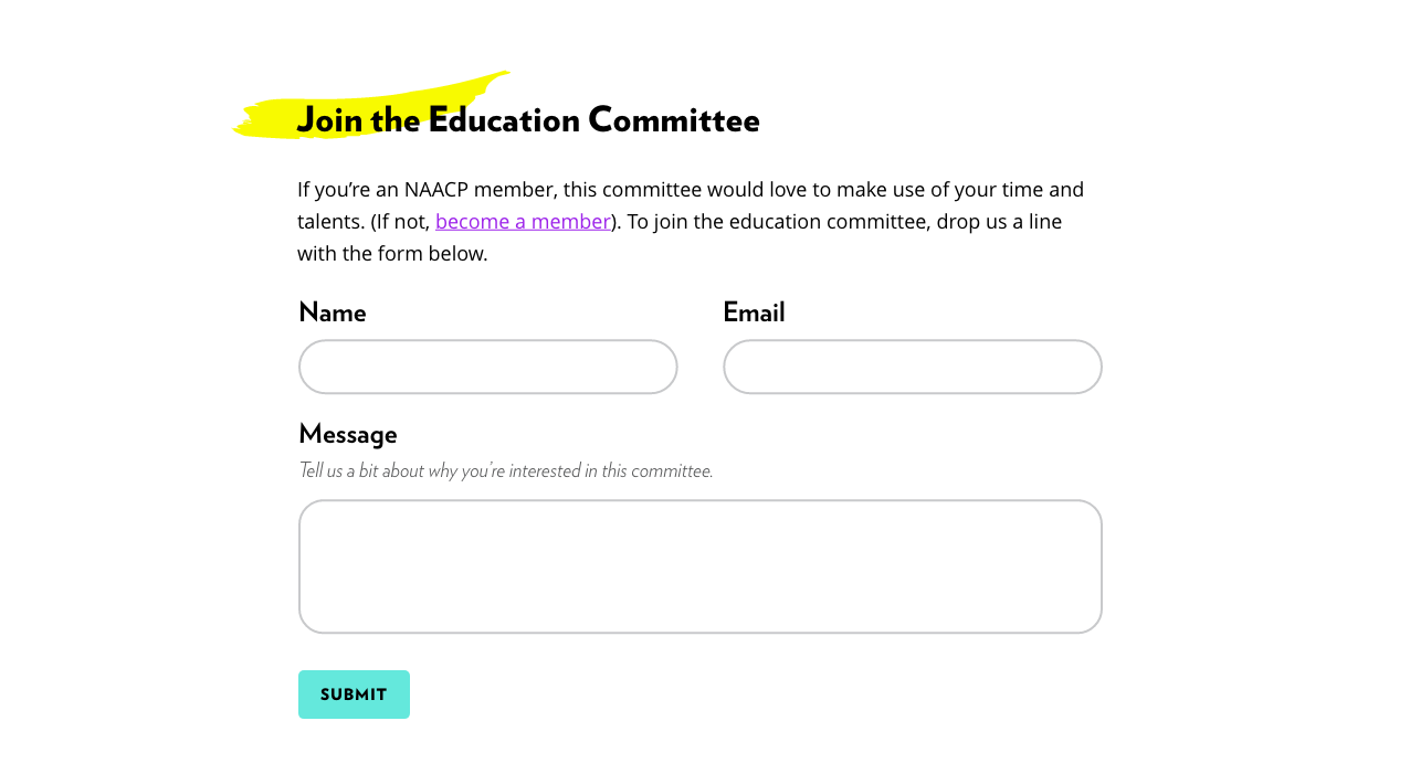
Education page visitors, for example can see a summary of what the committee is working on, engage in relevant action items, find important resources, read related news items, and contact the committee — all from that page.


This new site is incredibly robust to match the ambitions they expressed. The resulting design is something they’ll be growing into — and not out of — for years to come.